A passion project identity for a savings product: confident type, vivid colour.
How do you make passive yield feel serious and alive?
Carrot is a yield layer on Solana. You deposit stablecoins once and the vault spreads them across 8+ lending protocols, rebalancing toward the best yield. The product moves money all day, but its identity looked still. This passion project reinvents the brand, from strategy to a 3D motion system.
I led the creative direction, from strategy to the motion system
Positioning, audience, personality, logo, type, colour, 3D materials, social and outdoor applications, and product UI. Motion design with Paulo Alpuim.
The brand looked darker and quieter than the product
Carrot already had an identity, but it didn't feel serious, interactive or dynamic. The palette was dark and moody, where a product about money that keeps working needed brightness and energy.
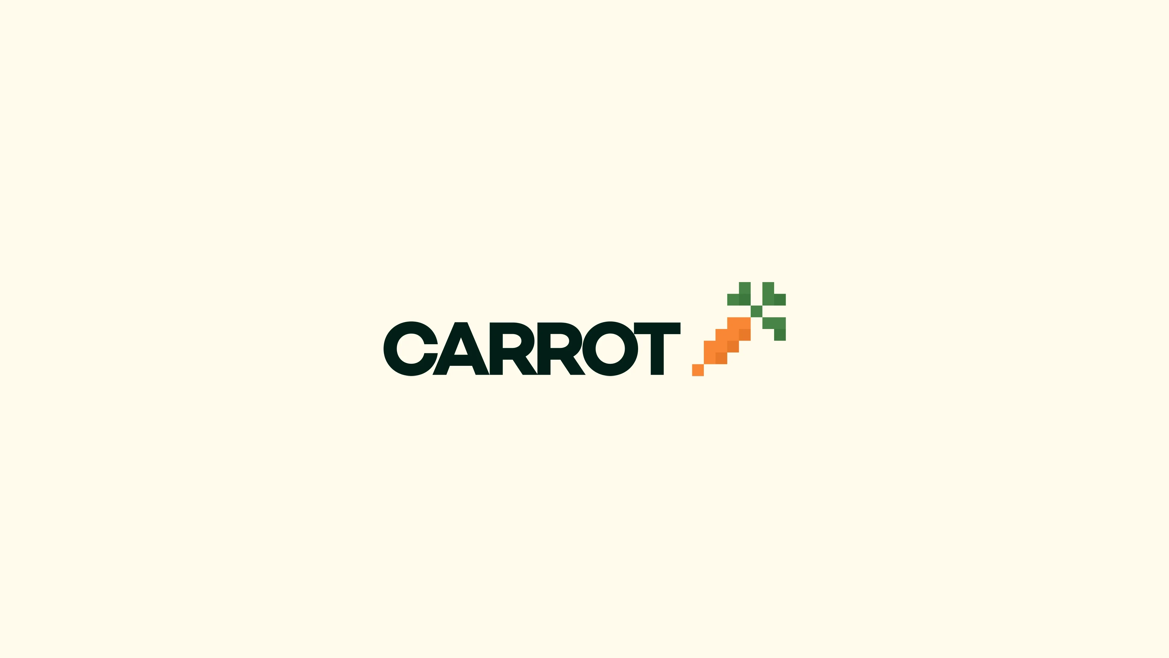 Before
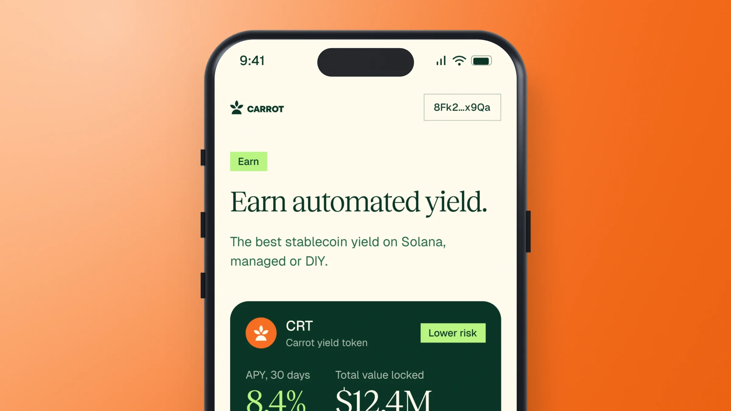
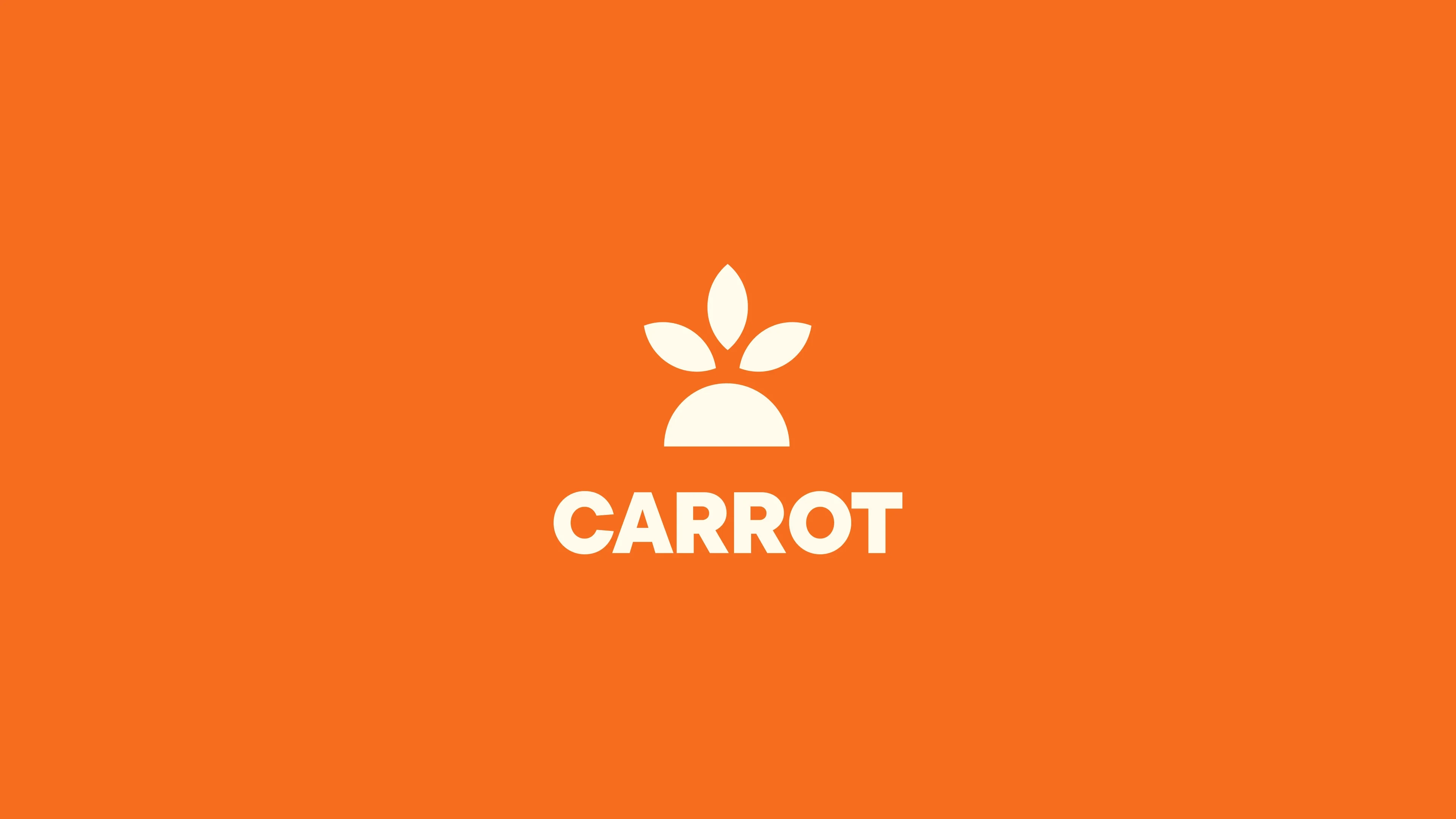 After
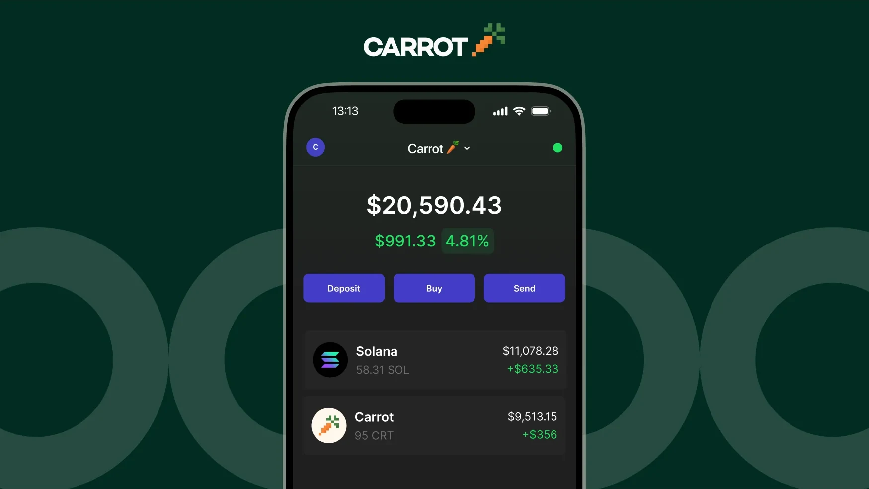
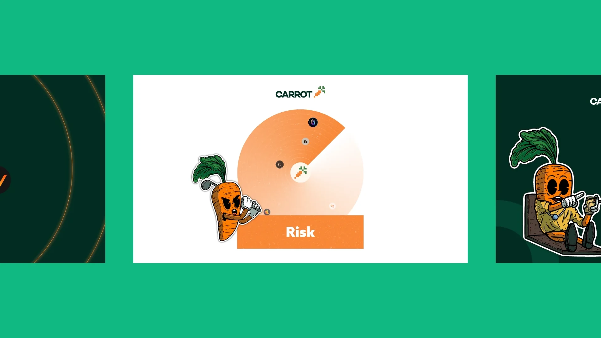
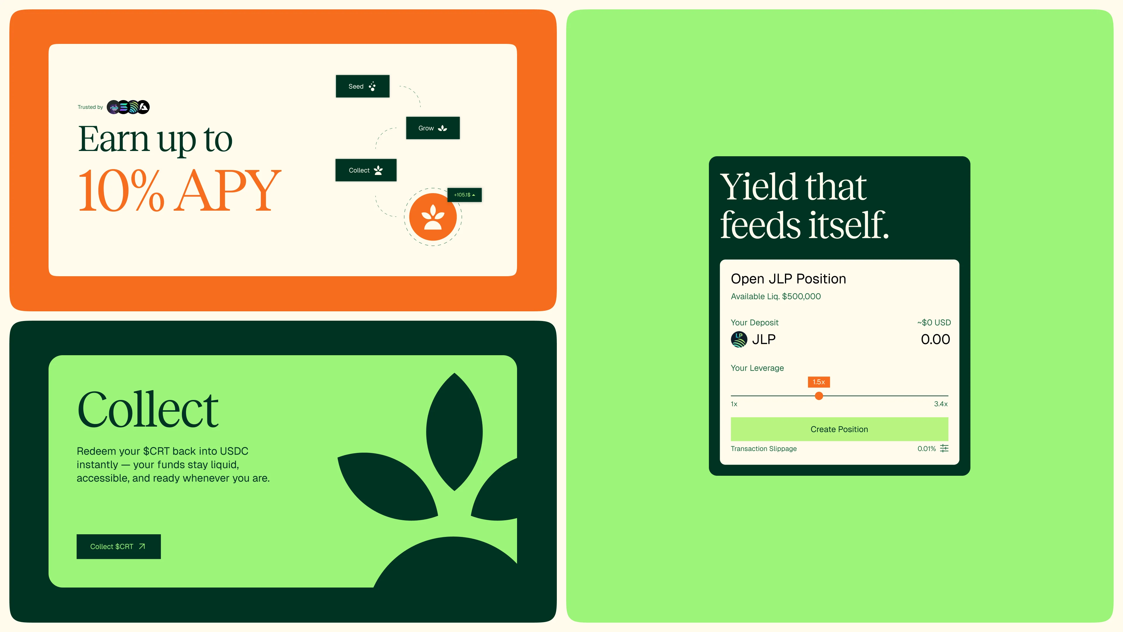
People judge a site's visual appeal within about 50 ms, and brighter, more saturated colours are rated more pleasant and more arousing. A dark, muted palette set a calm tone before any number was read, not money at work.
How a site looks is the most cited reason people give for trusting it or not. For a product that holds savings, a dated look costs trust.
Who is it for?
People in the Solana ecosystem who want passive income without managing positions across many protocols. They don't want to compare rates every day; they want Carrot to pick the best route for them.
Solana users holding stablecoins who want passive income, with no protocol hopping and no daily checks.
One deposit, routed across 8+ protocols toward the best yield.
Decision time grows with the number of choices, and more options can make people less likely to act at all. One deposit replaces a choice between dozens of protocols, and Carrot does the routing.
One idea: money shouldn't sit still
The position is managed yield on Solana, routed for you. The platform line, from the launch film, is money shouldn't sit still. Every piece says it with a figure, a promise or something growing.
Numbers first, plain words and risk named up front.
Carrot orange and lime instead of a dark, moody palette, with 3D materials and motion so the brand moves like the money.
Precise numbers read as more factual than round ones, and statements that are easy to process are judged more true. Lines lead with real figures like 0% and 0.05%, in one short line repeated everywhere.
A sprout, a serif and three bright colours
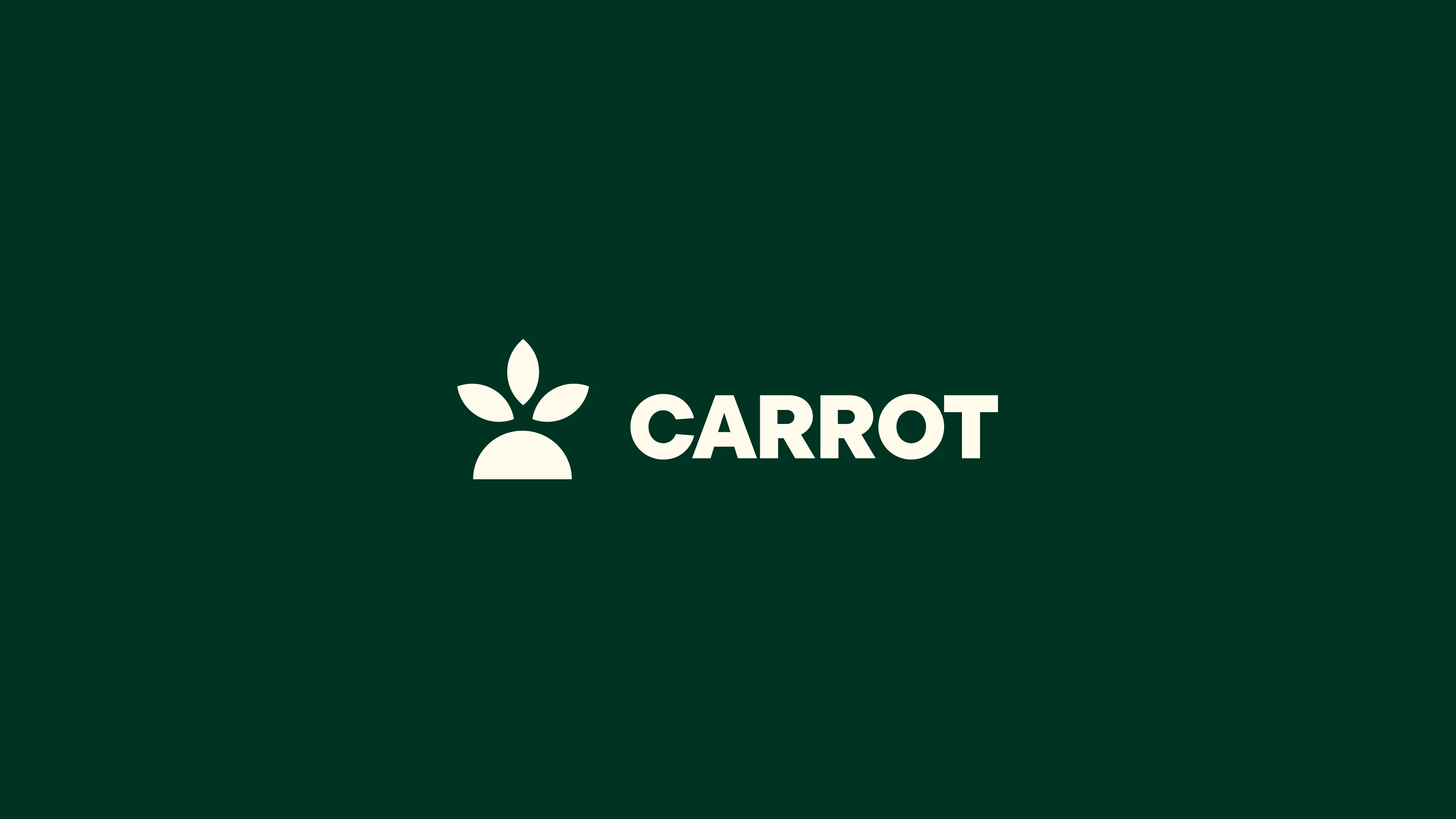
The pixel carrot became a simple mark: the carrot's leaves rising from a half circle, read as a sprout. Reckless Standard carries headlines and big figures; Geist carries the interface, body copy and data.
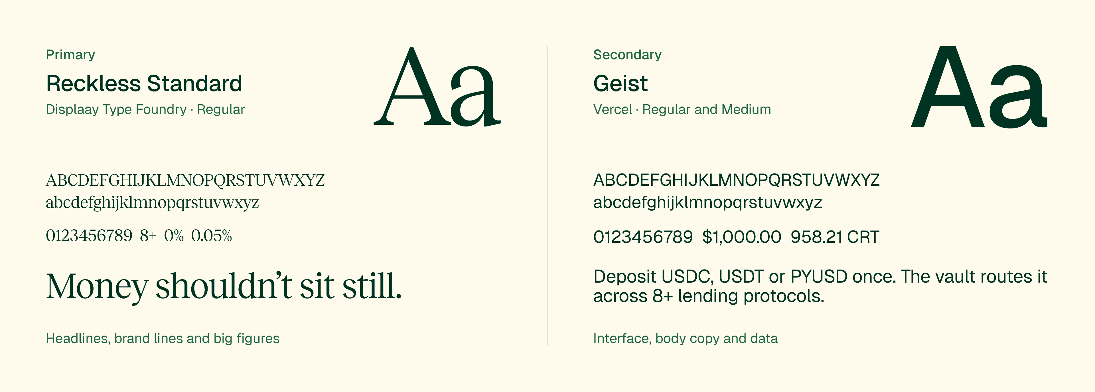
Deep green on cream measures 13.5:1 and on lime 10.9:1, far past the 4.5:1 that text needs. A serif for the message and a sans for the numbers keep the brand line and the data apart at a glance.
3D materials that move like money
Coins, stacked discs and the sprout were built as 3D materials, then animated into a motion system for social, outdoor and the website. Motion design by Paulo Alpuim.
The start of a movement captures attention even when people aren't looking for it, and shading alone is enough for the brain to see a solid shape. The 3D coins read as something you hold, not a flat icon.
The same line, everywhere
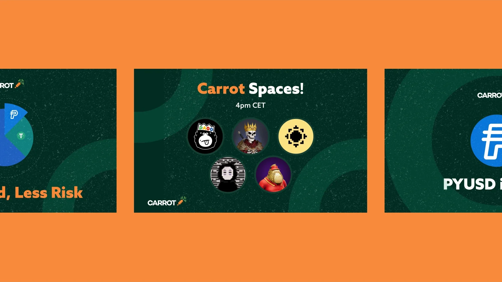
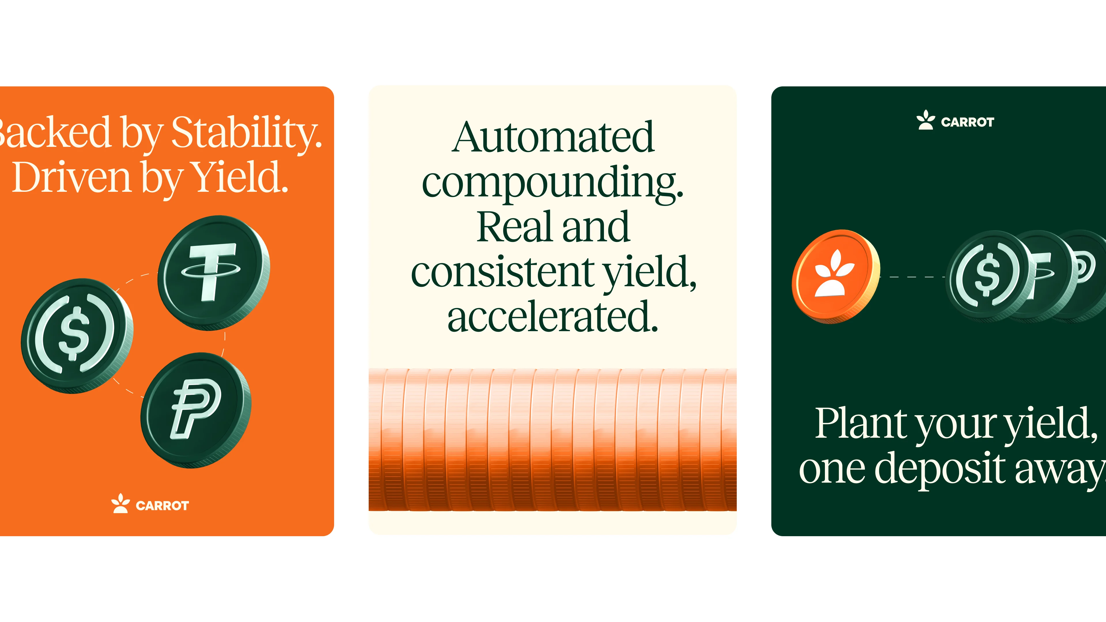
Social posts lead with one figure or one promise. Outdoor boards keep one idea each, readable in three seconds. Every piece ends on the sprout.
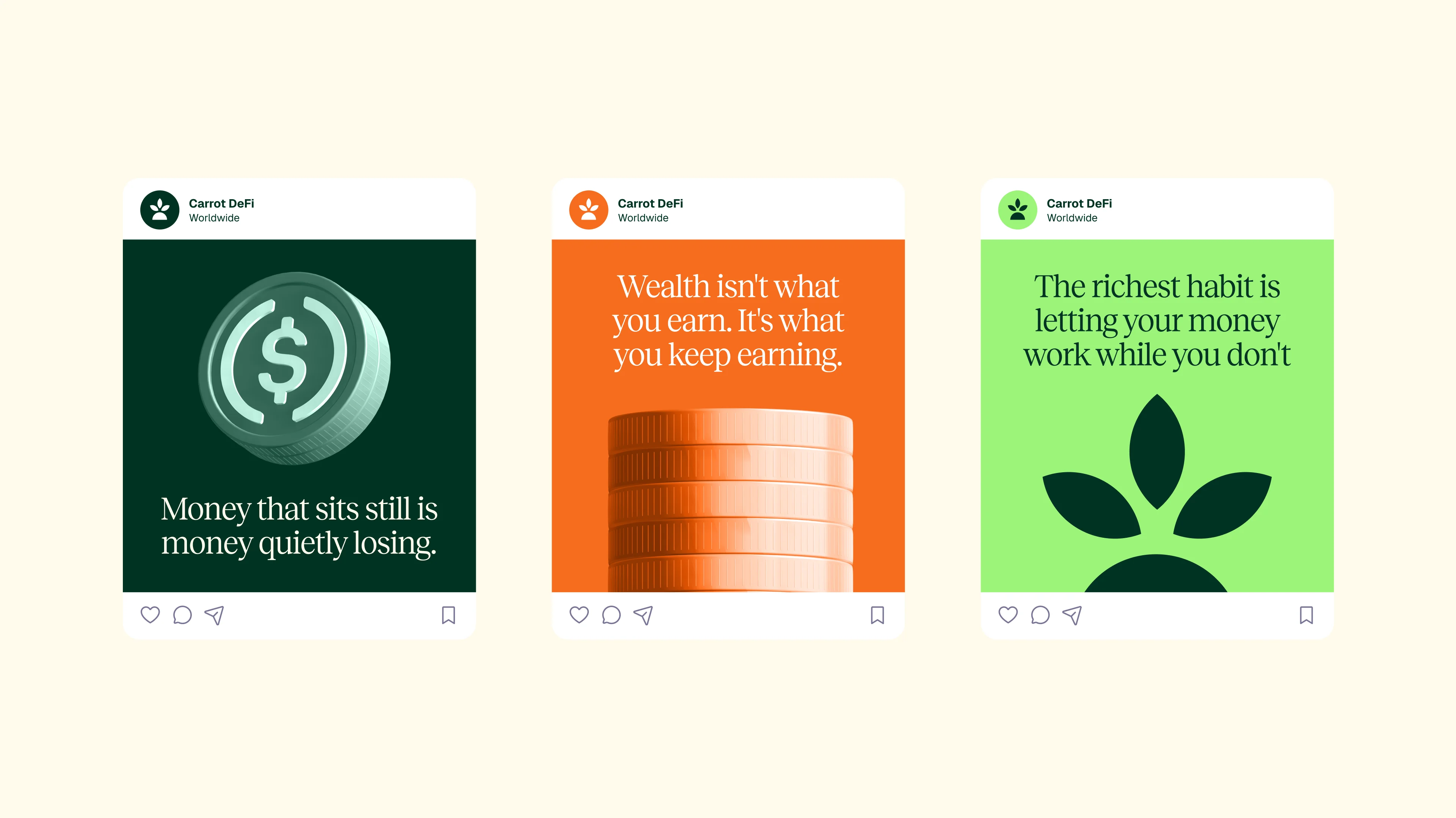
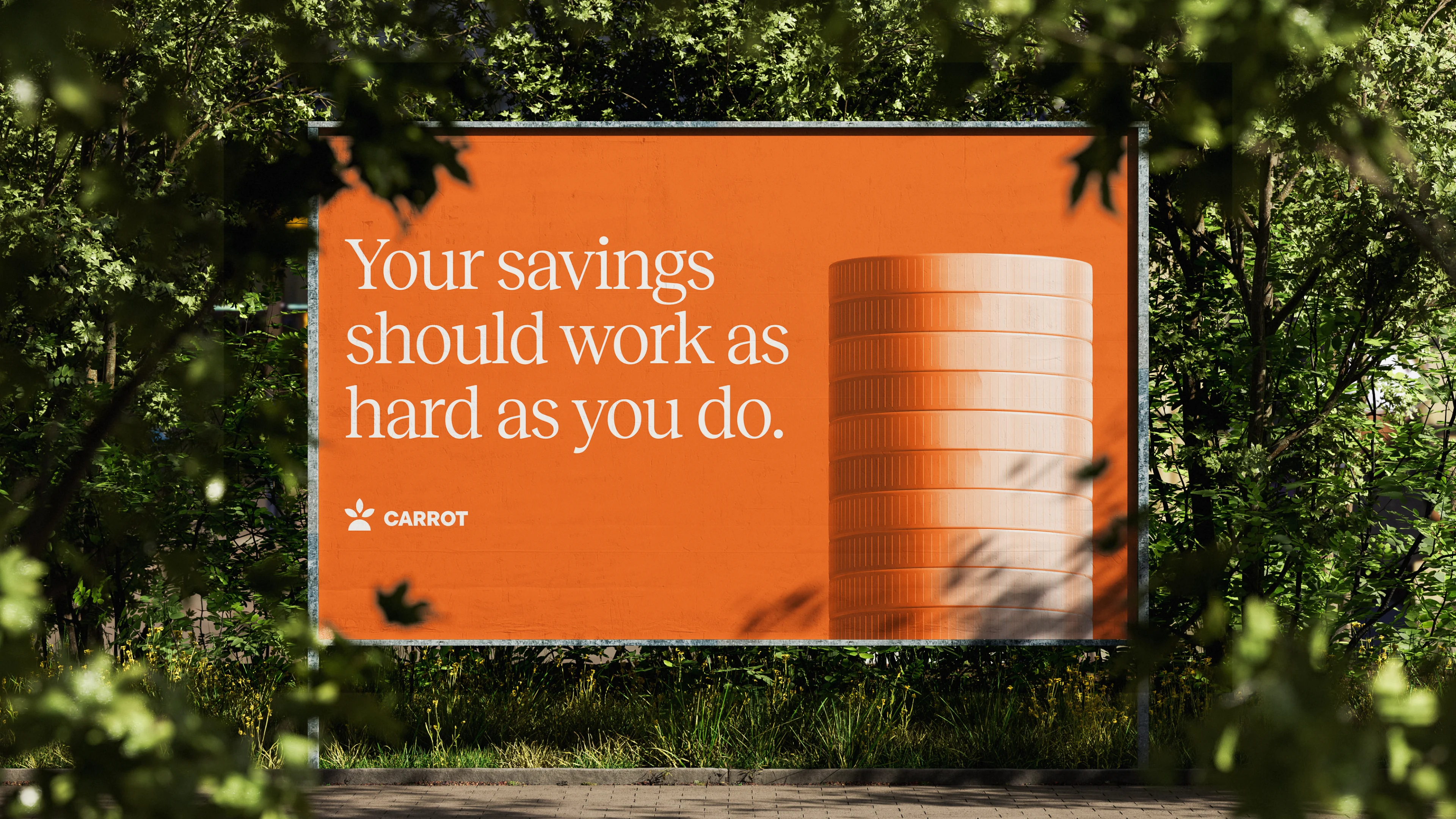
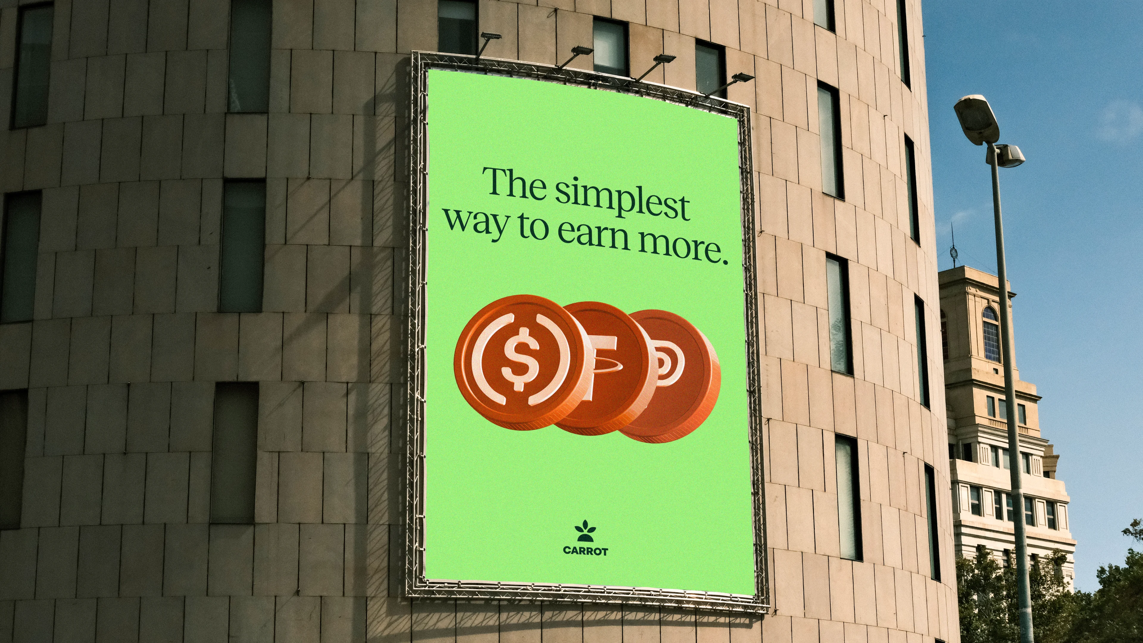
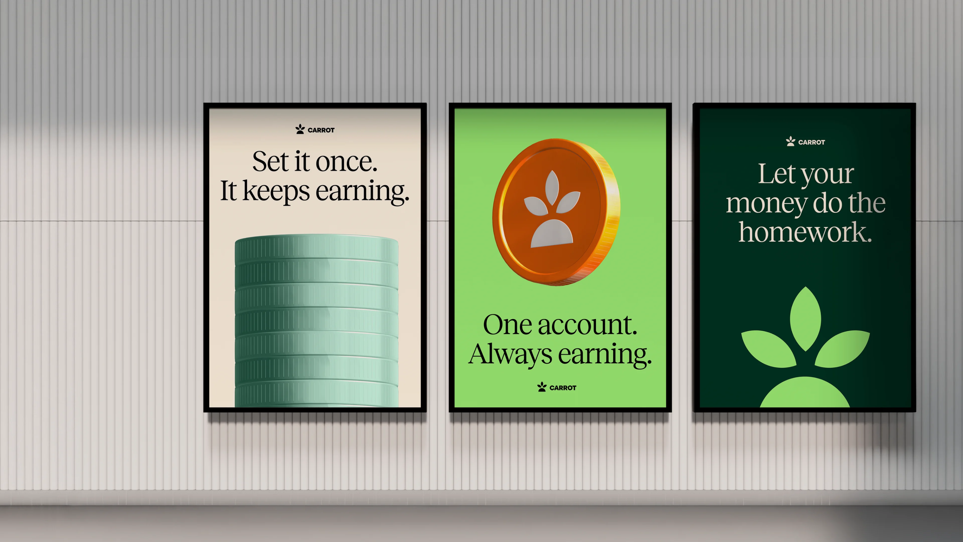
Pictures are remembered better than words, and repeated exposure makes a brand feel familiar and liked. Each piece pairs one line with one 3D object and closes on the same mark.
The app, rebuilt in the same voice
Carrot's app has five sections: Earn, Borrow, Boost, Turbo and Portfolio. Each one is rebuilt in the new identity, with a Boost pool page and a Turbo token page, following the live app's structure and copy. Cream ground, deep green panels, Reckless for headlines and big figures, Geist for every number, lime for the one primary action.
The same app, one column
Every screen stacks into one column on a 390 px phone: the action panel stays first, tables become one card per row, and the lime button stays in reach of a thumb.
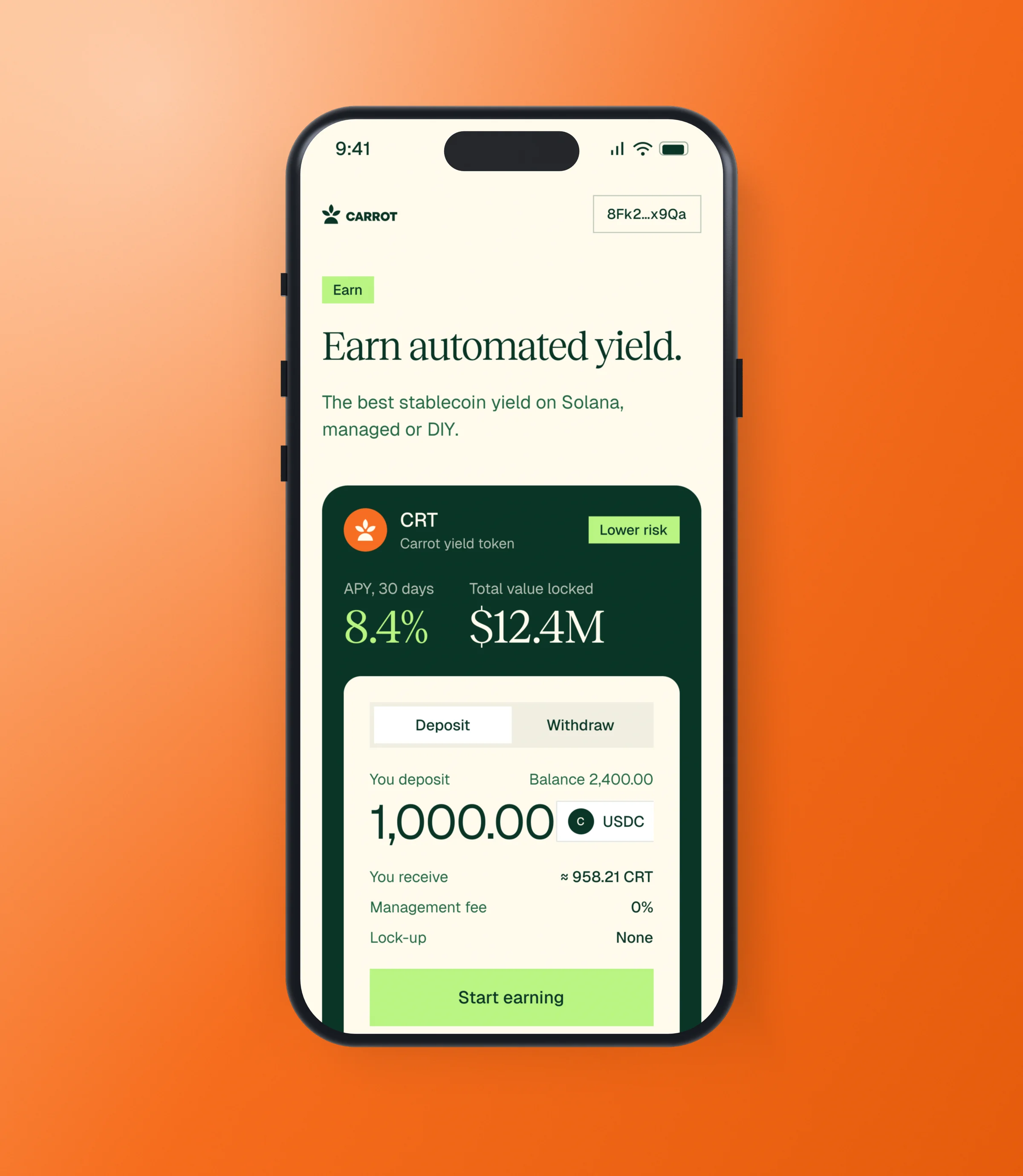
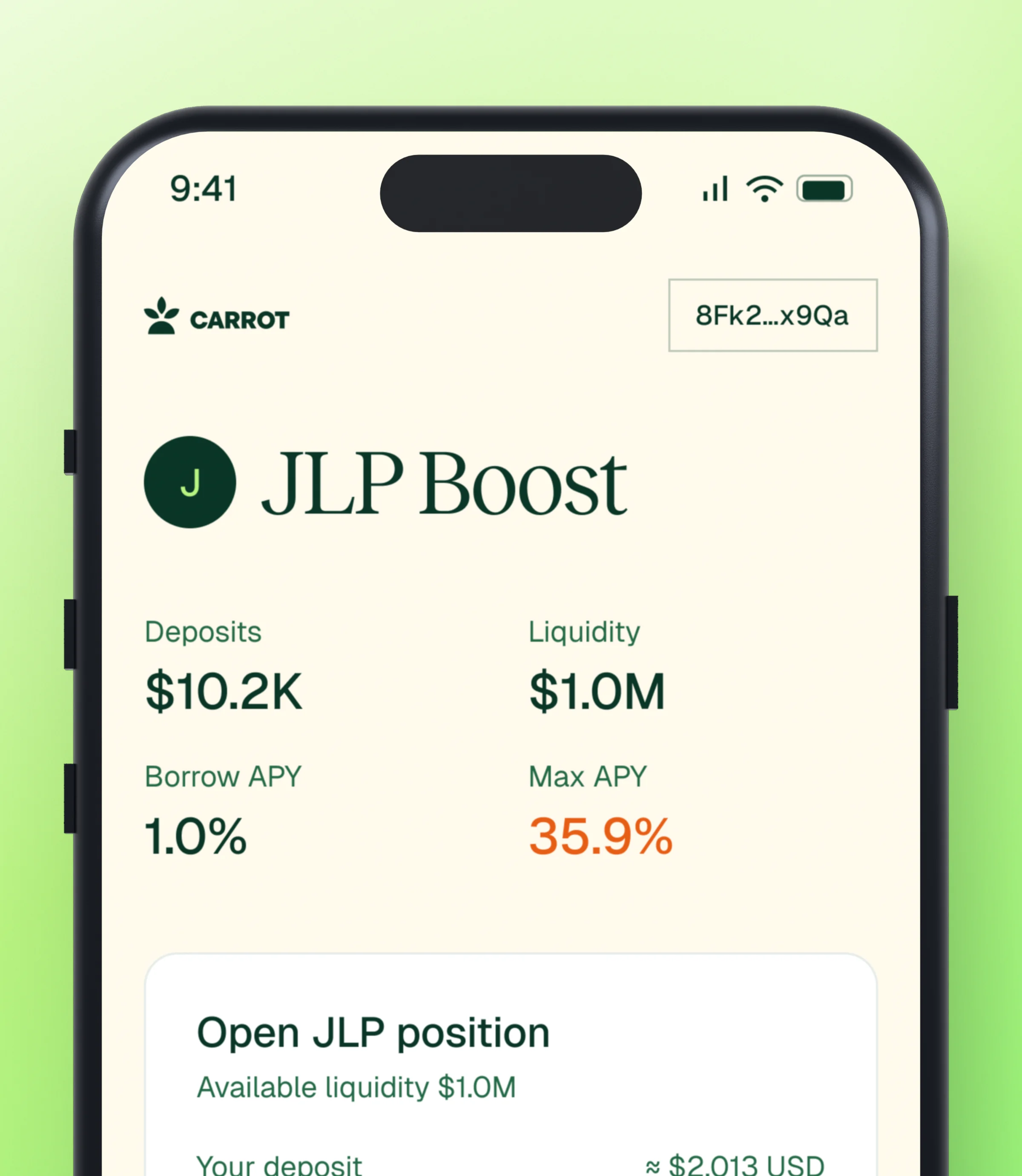
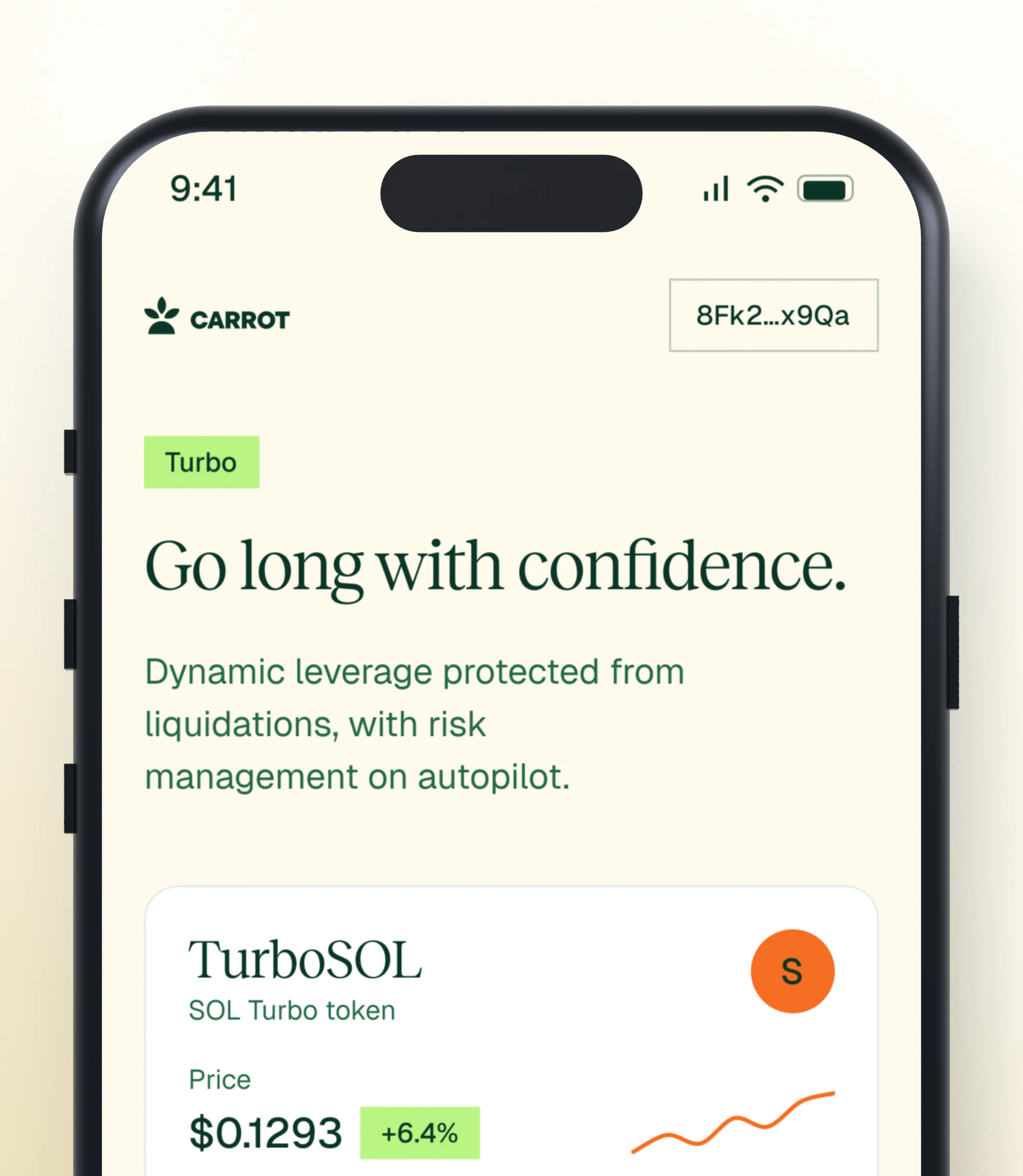
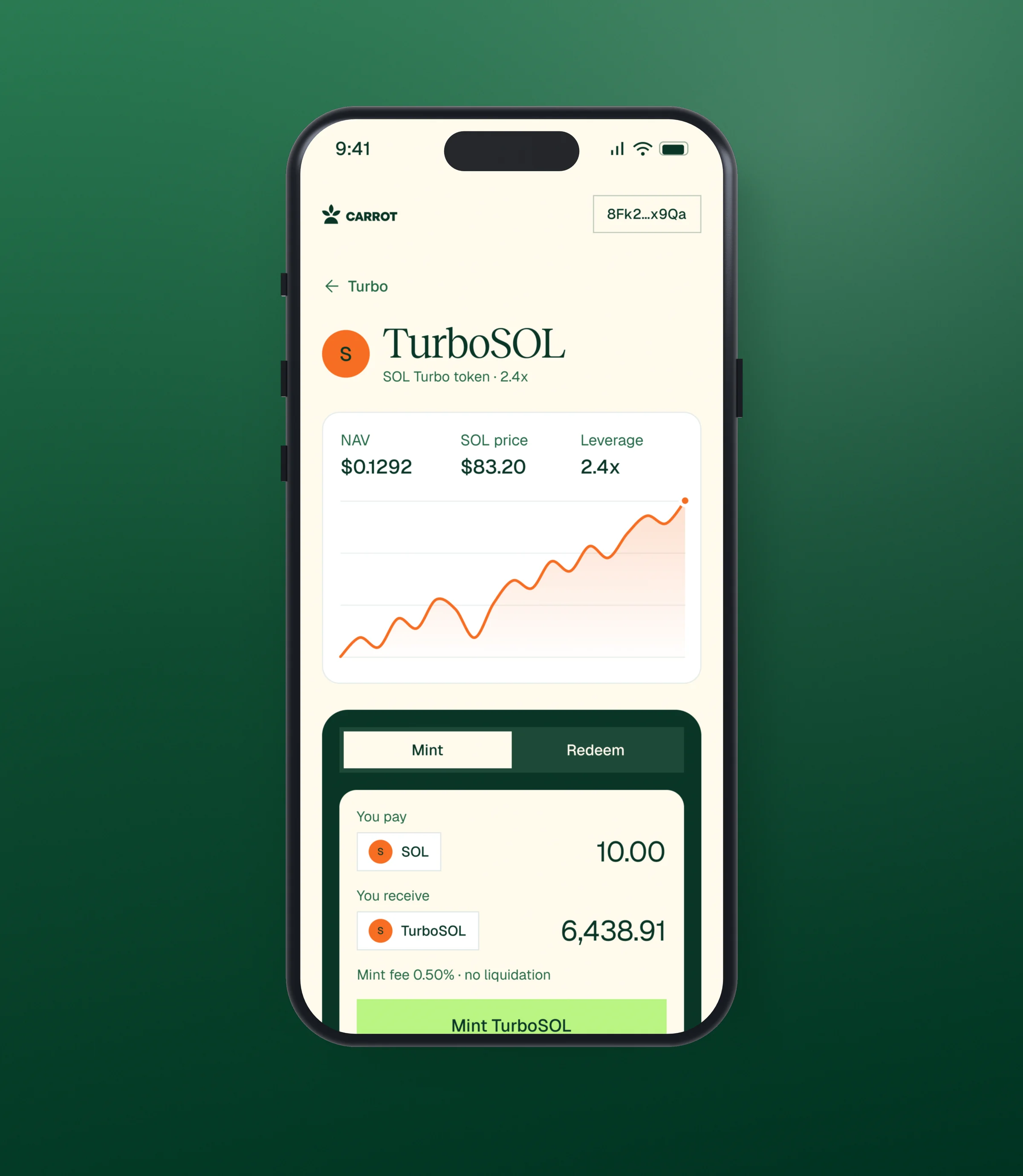
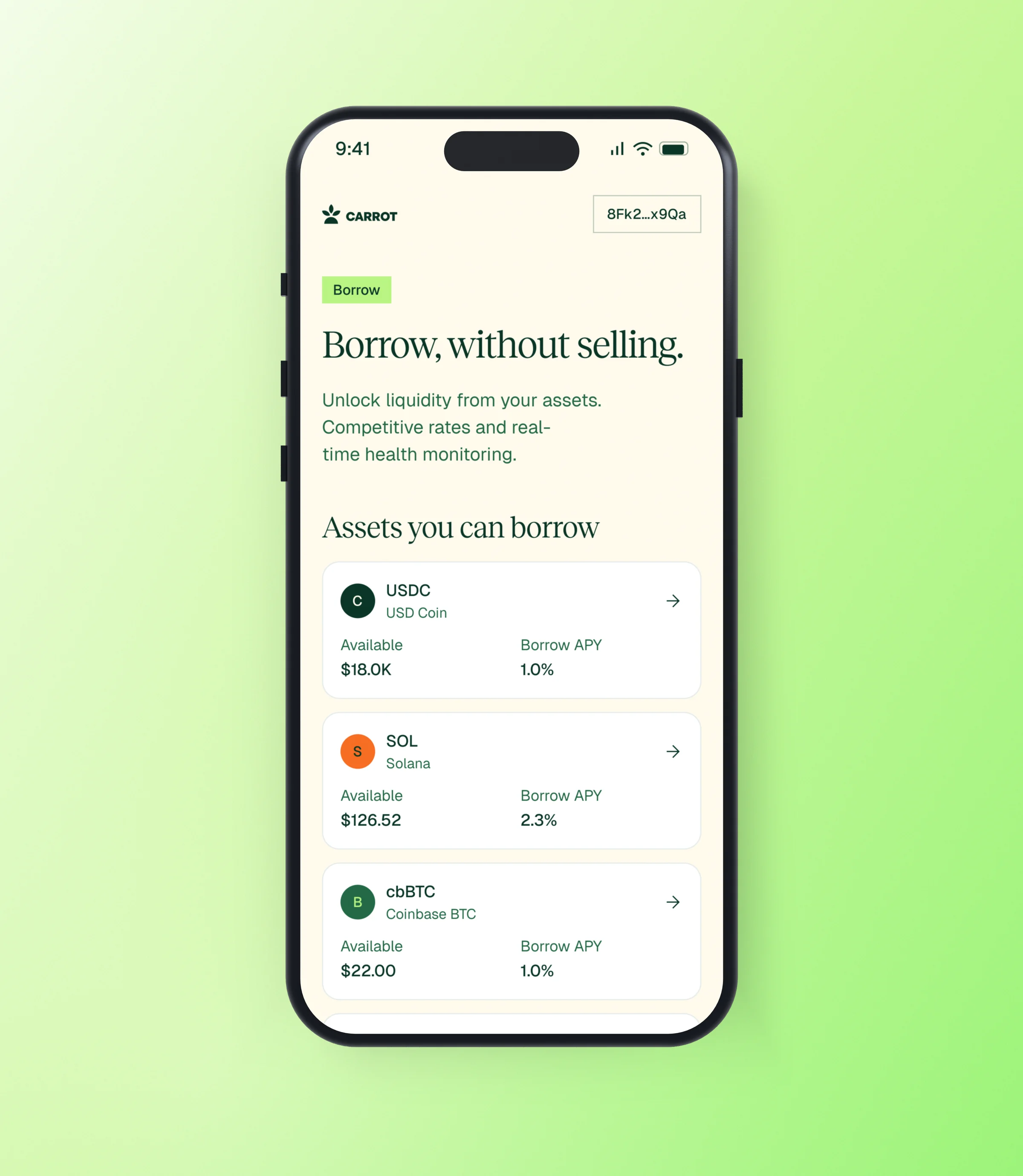
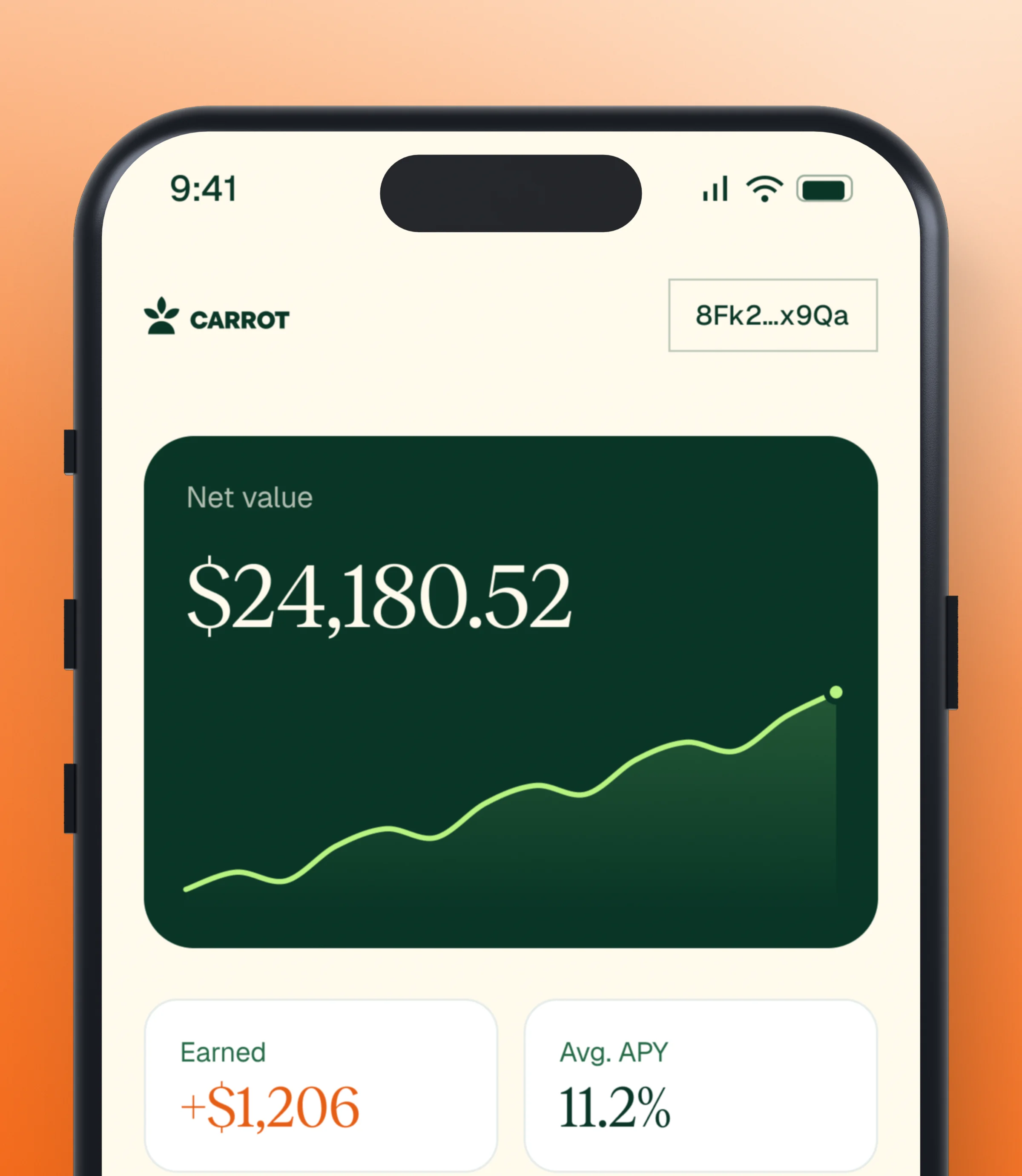
The same nav, action panel and lime button sit in the same place on every screen. Fees, lock-ups, health factor and liquidation price sit next to the action, so the state is always in view.
Each panel has a single lime button, so the next step is never in doubt.
A brand that moves like the product
- Abrams, R. A., & Christ, S. E. (2003). Motion onset captures attention. Psychological Science, 14(5), 427–432.
- Fogg, B. J., et al. (2003). How do users evaluate the credibility of Web sites? Proceedings of DUX 2003.
- Hick, W. E. (1952). On the rate of gain of information. Quarterly Journal of Experimental Psychology, 4(1), 11–26.
- Iyengar, S. S., & Lepper, M. R. (2000). When choice is demotivating. Journal of Personality and Social Psychology, 79(6), 995–1006.
- Lindgaard, G., Fernandes, G., Dudek, C., & Brown, J. (2006). Attention web designers: You have 50 milliseconds to make a good first impression! Behaviour & Information Technology, 25(2), 115–126.
- Nielsen, J. (1994). 10 usability heuristics for user interface design. Nielsen Norman Group.
- Paivio, A. (1971). Imagery and Verbal Processes. Holt, Rinehart and Winston.
- Ramachandran, V. S. (1988). Perceiving shape from shading. Scientific American, 259(2), 76–83.
- Reber, R., & Schwarz, N. (1999). Effects of perceptual fluency on judgments of truth. Consciousness and Cognition, 8(3), 338–342.
- Schindler, R. M., & Yalch, R. F. (2006). It seems factual, but is it? Effects of using sharp versus round numbers in advertising claims. Advances in Consumer Research, 33.
- Valdez, P., & Mehrabian, A. (1994). Effects of color on emotions. Journal of Experimental Psychology: General, 123(4), 394–409.
- W3C (2023). Web Content Accessibility Guidelines (WCAG) 2.2.
- Zajonc, R. B. (1968). Attitudinal effects of mere exposure. Journal of Personality and Social Psychology, 9(2), 1–27.